Frank Gehry: The Champion of Dancing Buildings & Deconstructivism
It's not often the case that architects grow to become household names. But Frank Gehry has never lived by any common practice. The award-winning architect has spent more than a half-century disrupting the very meaning of design within architecture.
From the iconic Guggenheim Museum Bilbao (which Philip Johnson called “the greatest building of our time") to the Fondation Louis Vuitton in Paris, Gehry has proven time and again the force that's produced when whimsical design is done masterfully.
Born in Canada in 1929, Gehry attended the University of Southern California and the Harvard Graduate School of Design. He began his career in Los Angeles working for Victor Gruen Associates and Pereira and Luckman.
After a brief stint in Paris working with Andre Remondet, he returned to California and started his own firm in 1962. Gehry was awarded the Pritzker Prize in 1989. A man with seemingly no limits, there is no bad time to celebrate Gehry's oeuvre. Below, AD survey's thirty-one of his most recognizable structures from around the world.
Walt Disney Concert Hall
Los Angeles, USA, 2003
From its striking outside to its intimate inside, Walt Disney Concert Hall is an architectural marvel that never loses sight of its main function - bringing music to the city of Los Angeles and beyond. Get to know the building that architect Frank Gehry designed "from the inside out."
The first view of Walt Disney Concert Hall most people see is the curving stainless steel skin of the building’s exterior. Resembling silver sails, the curves echo the billows in the auditorium and play off the bowed cornice of the Dorothy Chandler Pavilion, forging a link between new and old.
In architect Frank Gehry’s original design, Walt Disney Concert Hall was intended to be clad in stone. After receiving much acclaim for his titanium building in Bilbao, however, he was urged to change the stone to metal. With this new material Gehry was able to tweak the shape of the exterior, creating the iconic silver sails we see today.
Gehry’s team visualized the lobby as a transparent, light-filled “living room for the city,” opening onto the sidewalk. In contrast to the tightly enclosed foyer of the Dorothy Chandler Pavilion, the lobby would have a separate identity and serve as a symbolic bridge between everyday life and the inner sanctum.
Walt Disney Concert Hall was intended to be a center of civic activity, not just a destination for concertgoers.
Neuer Zollhof
Düsseldorf, Germany, 1998
Gehry's Neuer Zollhof complicated impelled the distinction in Dusseldorf, Germany's waterfront into what is straightforwardly known as the Media Harbor in 1999.
The observable nature of the trio of workplace structures yielded close to commissions for numerous unmistakable modelers like Fumihiko Maki and Murphy/Jahn, and earned the 3 towers a niche inside the Germand adjustment of Monopoly.
All three buildings are built of concrete flat slab with punched window openings at the outdoors facade. The finish cloth on each of the homes is precise.
The crucial workplace constructing is clad absolutely in metallic panels; the East (tallest) tower is created from curvilinear volumes completed in plaster, and the West tower is a grouping of volumes faced in brick.
Neuer Zollhof – otherwise called the gehry structures is a troupe of three structures: a white one, a red one and a - so run of the mill for gehry-silver one made of stainless steel. they are situated at medienhafen (media harbor), a urban reestablishment region in duesseldorf.
The Rheinhafen focus of expressions and the media with the guide of Frank O. Gehry incorporates 3 differentiating building edifices and appears like a major model. The exceptional materials picked supply every intricate its own personality. The external texture of the basic building shows the structures on its northern and southern side, subsequently building up a hyperlink among the 3.
Gehry House
Santa Monica, CA, USA, 1978
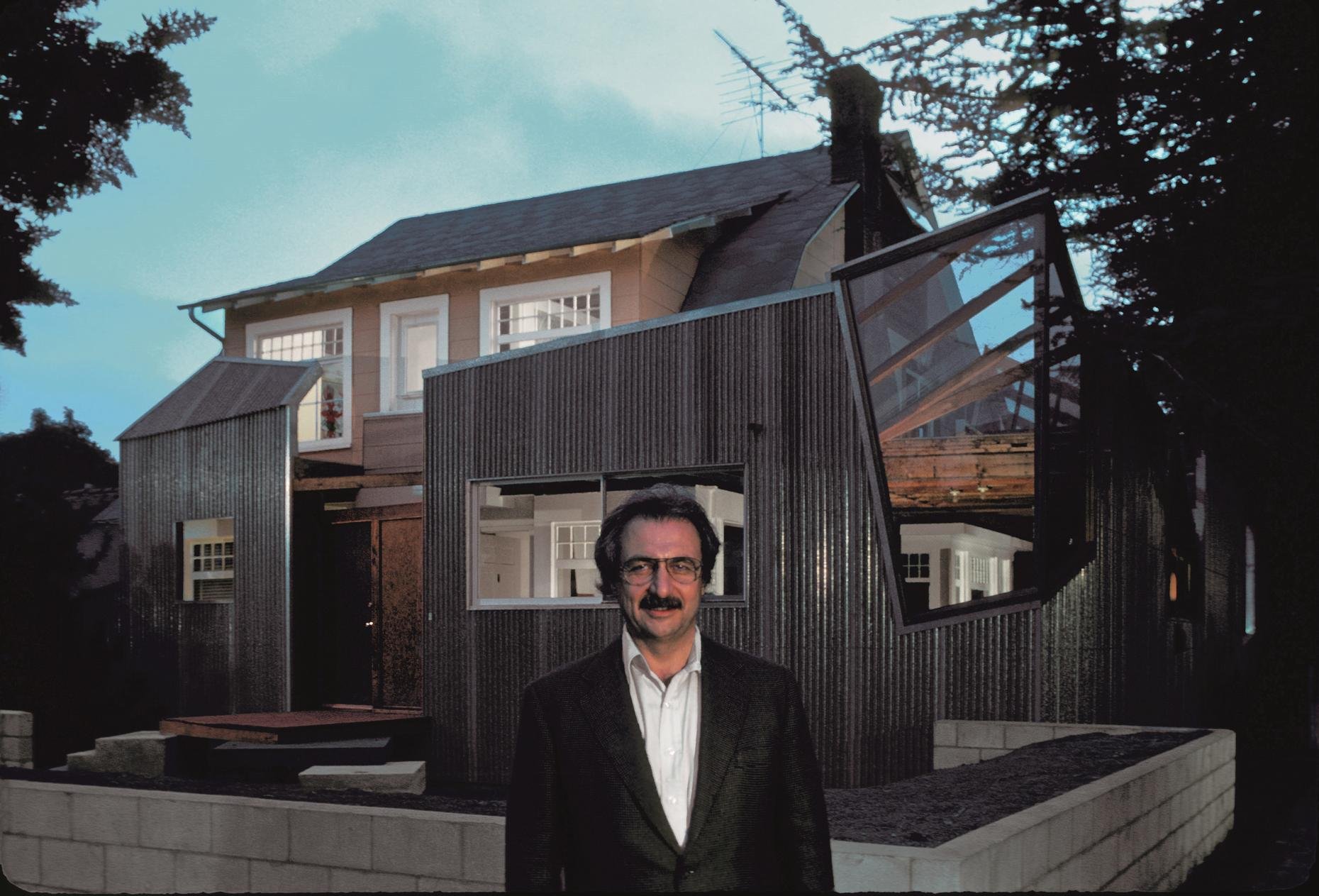
When Frank Gehry and his wife bought an existing house in Santa Monica, California, the neighbors did not have the slightest idea that the corner residence would soon be transformed into a symbol of deconstructivism. Gehry, however, knew something had to be done to the house before he moved in. His solution was a bold one in the 1970's that involved the "balance of fragment and whole, raw and refined, new and old" and would strike up controversy.
Gehry actually did keep the existing house almost completely in tact, but not in a conventional manner. The Dutch colonnial home was left in tact and the new house was built around it. Holes were made, walls were stripped, torn down and put up, and the old quiet house became a loud shriek of contemporary style among the neighboring mansions--literally. Neighbors hated it, but that did not change the fact that the house was a statement of art entwined with architecture.
Gehry's design wrapped around three sides of the old house on the ground floor, extending the house towards the street and leaving the exterior of the existing home almost untouched. The interior went through a considerable amount of changes on both if its two levels.
In some places it was stripped to reveal the framing, exposing the joists and wood studs. It was repaired according to the addition, showing both old and new elements. This is especially evident when walking through the rooms of the house and passing by both new doors placed by Gehry and older ones originally in the house.
The entrance is barely discernible amidst the jutting angles of the exterior, which Gehry created from wood, glass, aluminum, and chain-link fencing. The apex of the old house peeks out from within this mix of materials, giving the impression that the house is consistently under construction.
In 1991 due to the Gehry family's growth which involved two boys, the house had to be expanded. Even though Gehry tried to maintain the same style of the house, allowing the original design to determine that of the addition, the house went through significant changes. The residence became much more "finished" which in turn stirred up the angry voices of those who felt strongly about the original raw deconstructivist aesthetics. Nonetheless the Gehry House is still a classic among California's architectural works.
Olympic Fish Pavilion
Barcelona, Spain, 1992
Since the beginning of his career, Frank Gehry has investigated about the freedoms of expression that allows formal analysis of the fish. In the 80 years that some objects designed to explore these possibilities.
In this case, during the Barcelona Olympics, he was charged in a speech to the port which has very large steel structure in the form of fish, whose golden mark the start of the Olympic harbor promenade.
This was the first project that experimented with the computer to help him build its complicated structure and curvilinear forms that have skewed so much fame. This is a monumental metal sculpture.
Pez Dorado is a network of thin metal lines intersecting to form a lattice with a style markedly abstract. Nevertheless, it sensed the figure of a fish whose scales acquired a gold when they affect the sun’s rays.
Gehry describes his constructions “fish.” The skin of a fish or imply neither articulates how his internal organs.
However, a fish can be beautiful, definitely tailored to fit their environment, and its skin is used to keep the body dynamically consistent. The idea of the fish, he says, is an expression of their anger against useless historical references of postmodernism.
Gehry uses computer-aided design not to create their models, which are made by hand, but to provide precise specifications for their construction asymmetrical forms.
Dancing House
Prague, Czech Republic, 1994
The “Dancing House” is set on a property of great historical significance. Its site was the location of a house destroyed by the U.S. bombing of Prague in 1945. The plot and structure lay decrepit until 1960 when the area was cleared. The neighbouring plot was co-owned by the family of Václav Havel who spent most of his life there. As early as 1986 (during the Communist era) V. Milunić, then a respected architect in the Czechoslovak milieu, conceived an idea for a project at the place and discussed it with his neighbour, the then little-known dissident Václav Havel. A few years later, during the Velvet Revolution Havel became a popular leader and was subsequently elected as Czechoslovak president. Thanks to his authority the idea to develop the site grew. Havel eventually decided to have Milunić survey the site, hoping for it to become a cultural center, although this was not the result.
The Dutch insurance company Nationale-Nederlanden (since 1991 ING Bank) agreed to sponsor the building of a house on site. The “super bank” chose Milunić as the lead designer and asked him to partner with another world-renowned architect to approach the process. The French architect Jean Nouvel turned down the idea because of the small square footage, but the well-known Canadian-American architect Frank Gehry accepted the invitation. Because of the bank's excellent financial state at the time, it was able to offer almost unlimited funding for the project. From their first meeting in 1992 in Geneva, Gehry and Milunić began to elaborate Milunić's original idea of a building consisting of two parts, static and dynamic ("yin and yang"), which were to symbolize the transition of Czechoslovakia (Czechia) from a communist regime to a parliamentary democracy.
Marqués de Riscal
Elciego, Spain, 2006
Gehry decided to visit the place, as a preliminary step towards the acceptance of the assignment. Months after he spent a weekend at the winery and sample some of their wines, including a year of his birth, 1929.
At this time, and after learning addition, the place, its people and the program needs, and wagered believed in the project, imbuing entirely on the spirit of this centuries-cellar.
To launch the project after the success of the Guggenheim Museum Bilbao in cooperation with IDOM as a study partner in architecture, Gehry has again with their support for this new project, expanding the functions of architectural and engineering work with the drafting of the proposed architecture and engineering.
The architecture of Gehry follows a sculptural style and a personal vision of architecture, creating functional sculptures. It combines sensuous curves with complex forms masses, breaks new ground and creating new architectural language to achieve thus important and new results.
Gehry presents an innovative and avant-garde, in keeping with the spirit of Marques de Riscal. The explosion of color and shapes creates a movement through the forms flees from the building that foundation for its rise and mixed at high ambient and look at the surrounding landscape.
The building is a rectilinear composition of prisms that float above the ground thanks to three supercolumnas that support the entire building. Everything is wrapped in cascades titaneo (Canopies) colored.


